The Hitless Wonders. The Black Sox Scandal. The Go-Go Sox. The exploding scoreboard. Na Na Hey Hey Kiss Him Goodbye. The shower in the outfield stands. Those shorts. South Side Hitmen. Disco Demolition Night. Winnin’ Ugly. The Turn Back the Clock game. The Blackout Game…
Good or bad, the White Sox have always had a flair for the dramatic. And when Sox fans close their eyes, there’s no doubt a specific image – and a particular uniform – is burned in their heads for each.
When baseball happens in 2020, the South Siders will essentially be donning their black, white, and silver threads for the 31st straight year – easily the longest-tenured look in their long history of memorable uniforms.
I – and the vast majority of the fanbase – certainly don’t hate their current and classic look. They’ve worn it largely unchanged for 30 years because it’s GOOD.
But even from the current uniform’s onset, it’s always felt like a little something was missing. Their uniforms just don’t 100% jive with the full emotional range and fluid dichotomy of the established, upstart, riveting, upsetting, glorious, sad, wacky, fun history of the club. They’re instead cut and dry.
How can that colorful history and flair for the dramatic be worked into their look? Because I know you don’t want to scroll through another 5,000 words like it’s an online recipe, here’s what I’d do. Then you can read on for how I got there.
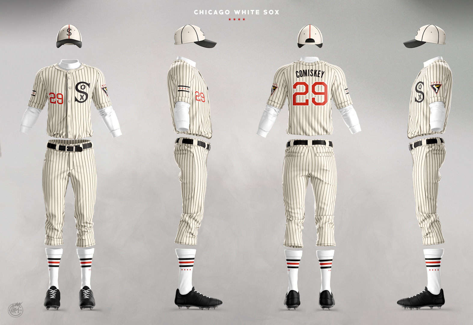
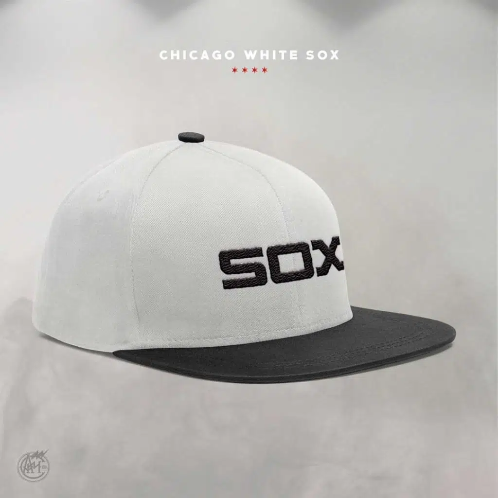
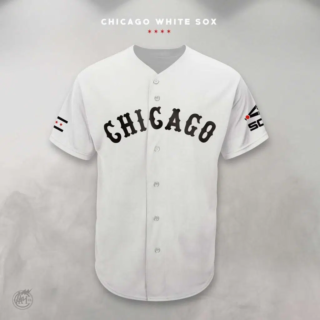
Primary Home Uniforms:


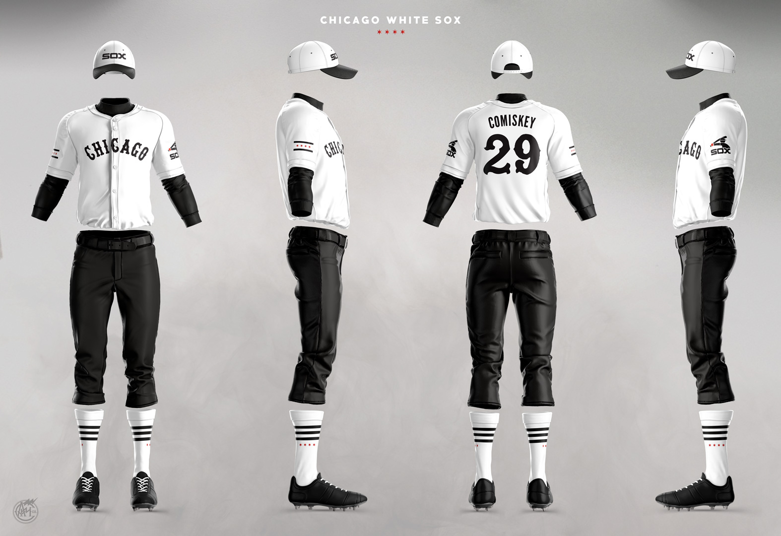
Primary Road Uniforms:


Alternate Home Uniforms:


Alternate Road Uniforms:


I’ve always just assumed each team is likely limited to a home, road and two alternates, but if that ISN’T the case, then I’d consider throwing some of these ideas in the mix as well:


From the onset, I wanted to accomplish 3 things with the designs:
- Pick one color scheme — that includes a splash of color — and run with it across the board.
- Actual white socks are a must.
- Retain a deep connection with the club’s history.
1. ONE color scheme — with a splash of color
It’s always fun to see the Sox don throwbacks on Sundays and for specialty games — but it also feels disjointed when there is nothing stylistically to connect the different unis other than saying S-O-X in one form or another. If they are truly going to have a UNIFORM set, I think it’s time to choose ONE color scheme to use across the board.
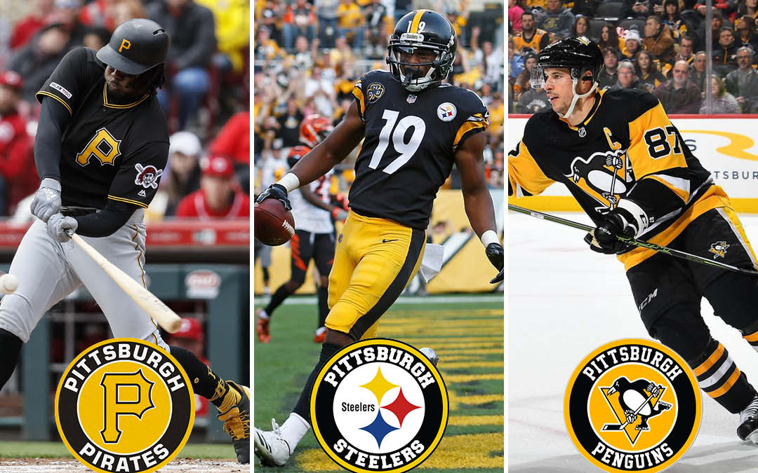
In addition to brand consistency, I think there is an opportunity to create a common identity with other Chicago clubs. The (black and) gold standard for this is the Pirates, Steelers, and Penguins of Pittsburgh:
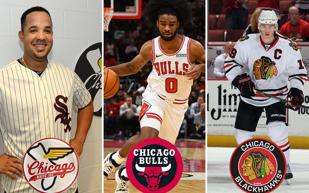
I think it makes a whole lot of sense for the White Sox to emulate this unity with the Bulls and Blackhawks. There’s the new TV deal, some shared ownership, and the increased recognition of this being a sports identity tied to the city of Chicago. And black, red, and white is by no means a stretch — it’s in the DNA of the club’s history.
In a vacuum, my personal favorite look for the Sox is actually a blue scheme. The 1969 home / away set is impossible to beat. But, black, red, and white also look phenomenal.
The White Sox need to do everything they can to differentiate themselves, and there are simply too many teams — essentially half the league — with blue as their primary color. While I also love the look of their early ’70s red unis, it just bothers me too much to have the White Sox use red as a primary color when there is also a Red Sox in existence. Maybe I take things too literally, but it’s just a non-starter for me. Which leads me to …
2. Actual white socks is a must.
This isn’t complicated. Your team name is the White Sox. A little flair (stripes, Chicago star detail, etc.) is OK. But my White Sox are going to wear white socks.
3. Retain a deep connection to the club’s history.
The White Sox uniform history is a beautiful mess. However through it all, I think they have two stone-cold classic looks. They’re also the two looks that they wore (or wore a variation of — present uniform included) for a longer period of time than any others.
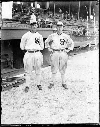

You will get a wide range of opinions from Sox fans on their favorite look from the team’s history. It usually coincides with the uniform they were wearing when you first fell in love with the club.
While the 1982-1986 uniforms that they currently wear for Sunday home games are beloved by a portion of the fanbase, they’re not my favorite. I don’t DISLIKE them, I just think the White Sox have other looks that better stand the test of time. Keep in mind, they originally wore these for only five years! I also see a lot of love for the 1932-1935 uniforms. It was a unique idea that was worth trying, but it’s ultimately too heavy-handed (and kinda dorky) for my taste.
The number one pitfall with having such a broad history of White Sox uniforms is the mashing up of different eras. A total no-no. I cannot shout and shake my fist at the sky angrily enough to convey how bad it really is when they do this:

I think the thing about the current uniforms that feels a little stale to me is the usage of silver. I’ve always felt its use was more about capturing the popularity of the Raiders, Kings, and Spurs looks from the specific time period of the end of the ’80s/dawn of the ’90s than it was about incorporating their history, as this WBEZ article articulates. I am all for creating something that can be popular, and it was rad when Dr. Dre started wearing a White Sox hat. Remember, my concepts really aren’t changing the cap. I just wish the White Sox felt less like a ’90s time capsule and more like a timeless and enduring look that pulls from its broader history.
Like rock attaining perfection in 1974, I also firmly believe that baseball uniforms reached their pinnacle in 1955. Just look at a snapshot of that year. With a few minor exceptions (like the Athletics franchise not yet having adopted green and yellow), every single team wore what is essentially a version of their current and most memorable uniform that year. The White Sox? It was smack in the middle of the black & red Go-Go Sox era. And while we’re at it, gimme some wings on that sock so it can fly!
Finally, here’s a smattering of other random stuff I played around with that didn’t fit into the above conversation:


Sources:
I’d be remiss if I didn’t acknowledge a few sources for all of the above. Obviously the logos I’m displaying here aren’t mine — they’re pulled directly from different eras of the White Sox uniform history, and Chris Creamer’s SportsLogos.net is a fantastic reference for all of it. Hopefully, you’ll agree that I’ve incorporated those logos in a unique way. The version of the flying sock shown in my patch concepts IS something I created for these, though it’s certainly based heavily on a logo they have used before.
The absolute best resource above all else is the work of Marc Okkonen. I have a hard copy of Baseball Uniforms of the 20th Century that I open on nearly a daily basis, and his immense influence on everything I’ve put together here should be pretty apparent by the number of times I link to Dressed to the Nines: A History of the Baseball Uniform Uniform Database.
Okkonen, Marc, Baseball Uniforms of the 20th Century: The Official Major League Baseball Guide, Sterling, 1991.
I’ve evolved a lot of these ideas since I first posted them on my blog in 2013 (and updated in 2015). One of the more notable ways I’ve updated them for this iteration is that I have incorporated them into the now-standard Grand Slam template created by sportstemplates.net.
And one of the funnier things that has come out of sharing these ideas is that an offshore company now has available for purchase some bootleg versions of some of my ideas. The oversizing of the logo elements is pretty comical.
What are your thoughts on the above concepts? Join the conversation and comment below!
Great ideas- we need to add a color (red or blue) to the classy yet boring color scheme.
I opened this article with a lot of skepticism, but
you really have a great vision for future changes
to the uniform styles. By embracing the best of the past, the Sox would look great for the future.
The proposed new uniforms look very amazing accept the hat should have some red on the logo to match better with that uniform. Also the pinstriped pants don’t need an additional racing stripe on the sides. That’s to much.
I think the old logo with the huge “S” looks great as well and I do like the idea of a road uniform using the same “Chicago” script that was used by the famous South Side Hitmen team of ‘77.
I think the Sox bringing back some red nicely aligns themselves with the Bulls and Blackhawks teams. I always thought that the Sox should adopt the “flying sock logo” as a primary patch. That would be a nice nod to the “Go-Go Sox” of 1959.
Clearly this artist understands and embraces the history of the Sox long-storied tradition of having a million different uniforms in their history.
Nope. They are perfect as is. Don’t touch them.
The primary home and road unis are cool
I like most of these new options, however, I would love to see the 1970’s red pinstripes be another alternate home uniform but if they go back to the 50’s/60’s unis that were the thing in 1959. I would be happy too. I don’t not like those 1983 softball uniforms that they wear on Sunday home games and I’m sick to death of the black ones, UNLESS they would read “Chicago” on the black (current) jerseys on the road.
I like all of it. I think you’ve hit the nail on the head with each one and would love to see these designs adopted. Also, you’re mention of the blue 1969 uniforms is appreciated. I loved those too as well as the powder blue and red road uniform from the 70’s.
You nailed it! I wish the Sox had changed unis after the ’05 season to punctuate that era and that great team.
Really would like to see the Sox get color back in the unis as you have so well demonstrated. Green trim would work for me too. And, yes, getting those “white socks” in there is a necessity.
These are extremely well done, well thought out and look super sharp. I know you’re a Sox fan but would be so interested in your take of all major league teams.
Your final shoulder patches are…problematic. The flying sock version will be extremely difficult to embroider, because it’s far too cluttered and intricate. Oddly enough, you rejected a much better alternative, the plain flying sock. Even the flying sock in the black diamond is better.
As for the flag, if you’re going to use it, use it with the proper colors. The Sox added it as a decal to the back of the helmets in 1991. That’s the right amount of usage.
In all, not bad. I prefer the status quo. I emphatically agree with you on bring back actual white socks.
Love these, but why put pinstripes on the home primary to take them away on the road primary?
I say pinstripes on the road primary, and replace the script ‘Chicago’ writing with your logo from the home primary. Keeps it consistent. Switch it up on the alternates. But overall, you sir, have immense talent.
Most of these uniforms are nice. The primary home and road uniforms are great.
Andy, these are brilliant!
I like most of this. Primary home is the best of lot. Neat trick getting the old design without looking like a black and white movie still.
Not sure I’m ready to overturn what’s there now though.