For as long as I can remember, I have always been head-over-heels in love with sports aesthetics. My dad lined my bedroom with baseball pennants and helmets, including this one front-and-center on display on my dresser.
When I was in middle school, I became obsessed with Tony La Russa Baseball II, which featured all-time rosters for every MLB franchise and was WAY ahead of its time when it comes to baseball video games. It featured fantasy drafts, injured lists, trades, and full team customization (even down to the uniforms). For a nerdy kid who loved sports in the early ’90s, it was like a dream come true; NOTHING like this existed before.
Anyways, when it came time to choose a franchise, I wanted to pick a team with a good roster, a storied history, and of course, cool uniforms. I chose the White Sox every season and with my Baseball Almanac close by, I was able to learn about guys like Eddie Collins, Joe Jackson, and Luke Appling (my 1-2-3 hitters in the game actually). Ever since, I’ve had a soft spot in my heart for the White Sox. I still have my Big Hurt rookie cards, as well as some Wilson Alvarez cards, because my dad insisted he was a star-in-the-making after throwing a no-hitter in his first start. This is a long way of saying, sure I may not be a Sox fan, but I strongly support you guys and have an abundance of love for Chicago.
I think the Sox visual identities are one of the lesser-known treasure troves in sports design. The array of logos, colors, and styles the franchise has sported over a dozen decades is wide-ranging to say the least. I don’t know if there are any other franchises who have such a beautiful set of caps past-and-present than the White Sox. With this in mind, I had a lot of fun mocking up Sox caps in Photoshop and was honored when approached by Sox On 35th to feature a few of my designs on the site.
I try to keep things somewhat historically consistent with most of the concepts I make. In other words, I won’t slap a Sox logo onto a yellow hat or use colors that have nothing to do with the team. I also try my best to use patches and logos that are at least somewhat close to each other historically.
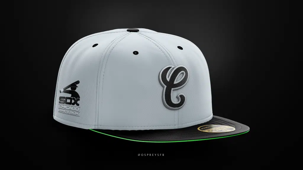
This first cap is a hybrid of the Sox current away uniform colors and their logo set from 1987-1990, which I consider one of the gems of baseball past. Just look at the script across Big Hurt’s (pre-Nugenix) chest. He looks happy, because ANYONE would be happy wearing these. Amazingly, I still consider the pinstripe set the team adopted two seasons later an upgrade.
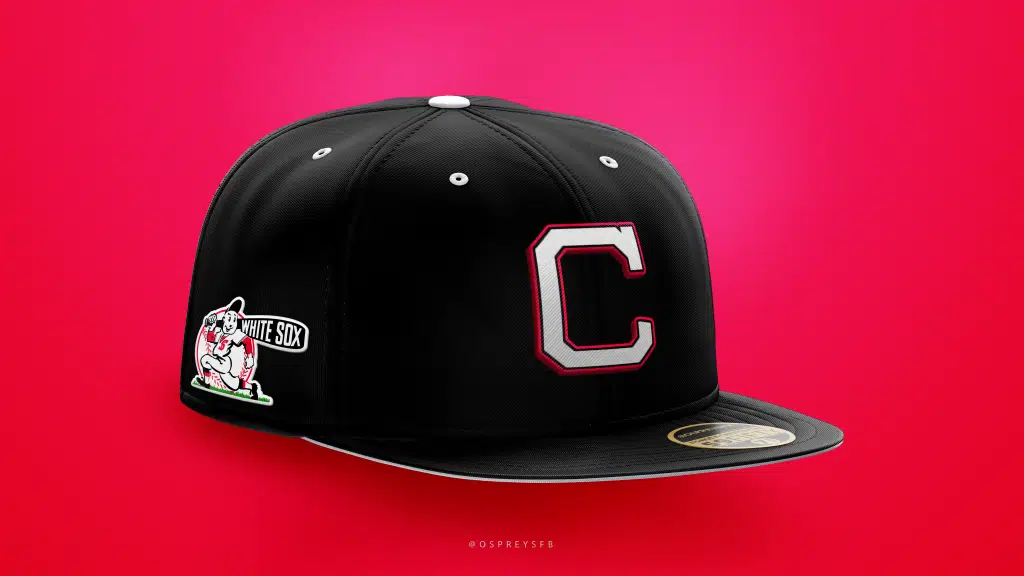
Reaching way into the box of old logos, I incorporated the cap logo from 1939-1945 and the team’s primary logo over that same period (and a few years after) and again, working in a later era the team’s colors. I shared these caps on Reddit and received some feedback that the caps looked too similar to Cleveland. That may be true, but I can’t change the past, Reddit. Lord knows I would if I could.
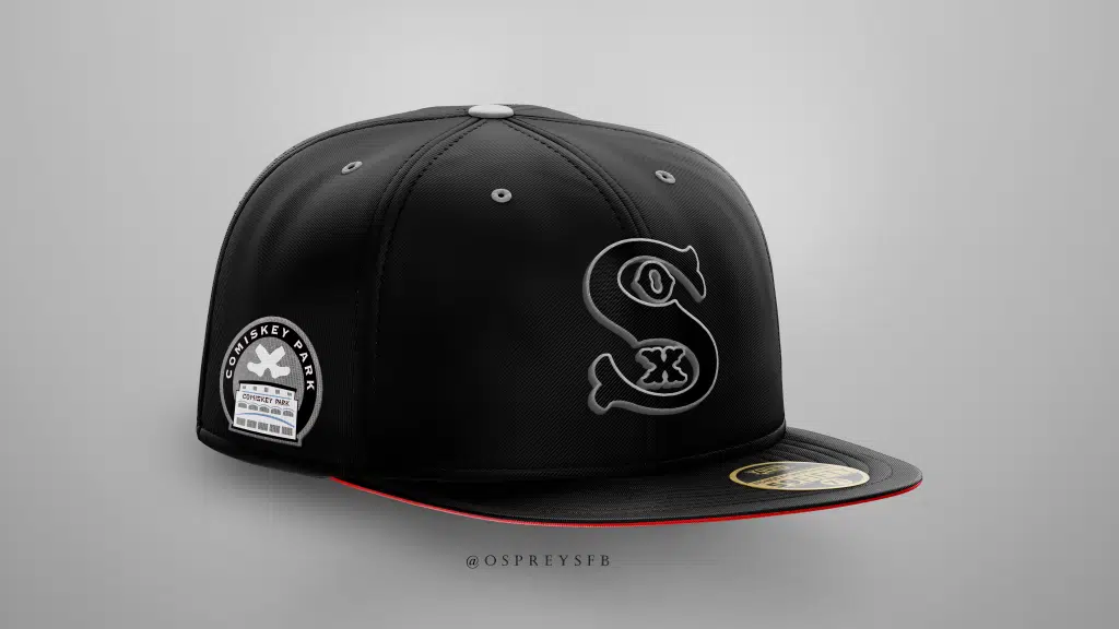
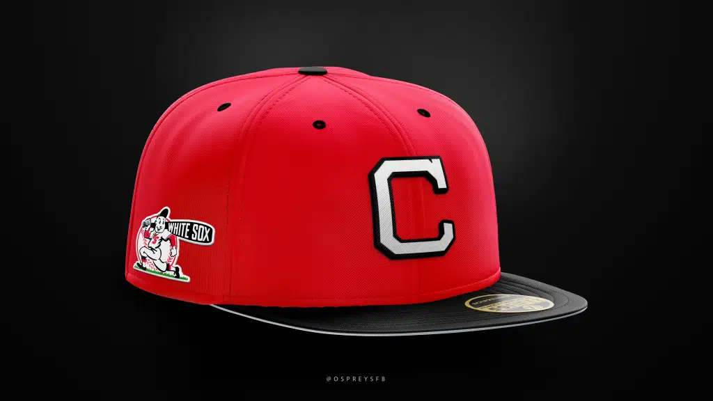
I saved this design exclusively for this article on Sox On 35th – one of my favorites. I used the iconic primary logo from 1936 and a modified version of this Old Comiskey Park patch.
I hope you enjoyed these, Sox fans. I know I enjoyed making them and sharing them with you. Lastly, Sox On 35th was kind enough to offer to show off a few of my other cap concepts, so who am I to say no?
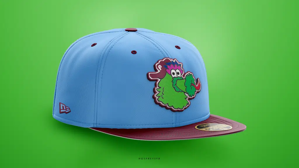
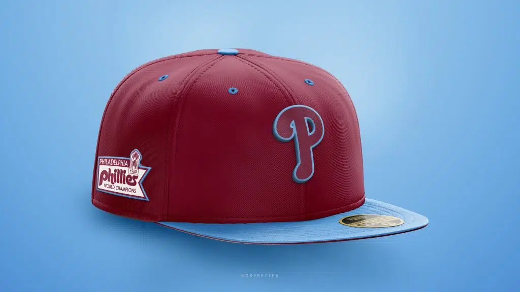
If you check out my Twitter profile or my Behance page, you’ll see some recent designs for one of my works-in-progress, a set incorporating all of the MLB mascots (and one for the Yankees featuring a short, stocky, slow witted bald man wearing a body suit).
The Phanatic, hands-down the crème de le crème of mascots, is featured on the first cap and this is the one that started the mascot series off. In both Phillies designs here, I used the old maroon and baby blue color set from the 1970s-80s.
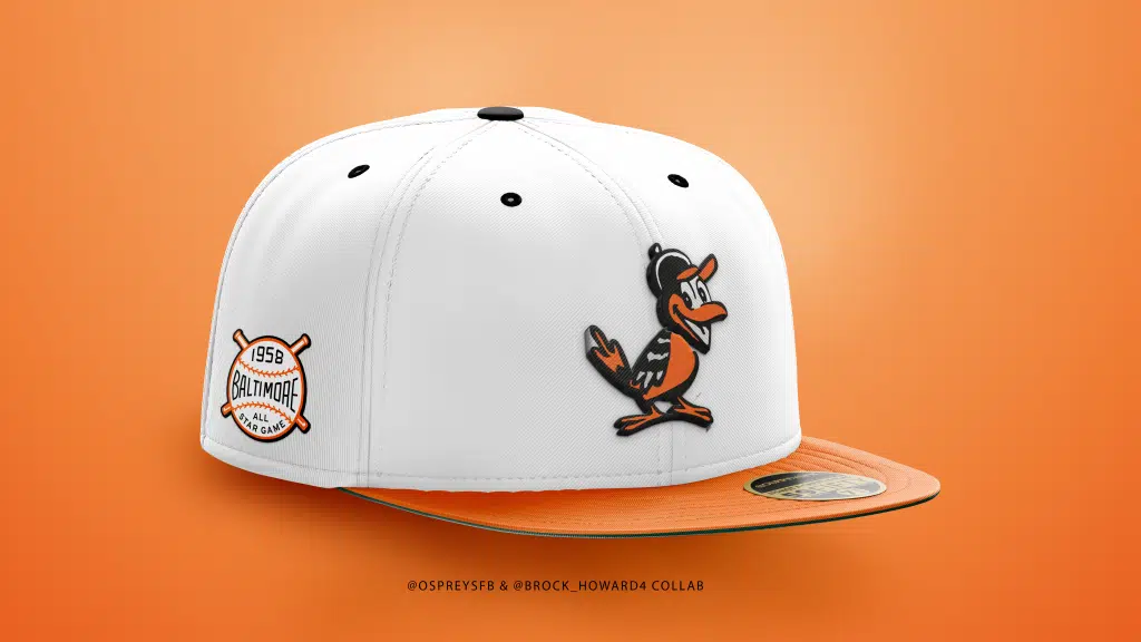
One element I enjoy about sharing designs on Twitter is that I tend to receive legitimately interesting feedback and ideas from fans of whatever team who are being featured and from folks who are even more as passionate about fitted caps as I am. Some ideas I would have never thought of, like this O’s cap that @brock_howard4 provided notes and inspiration for, using an old alternate logo that I cannot remember ever seeing.
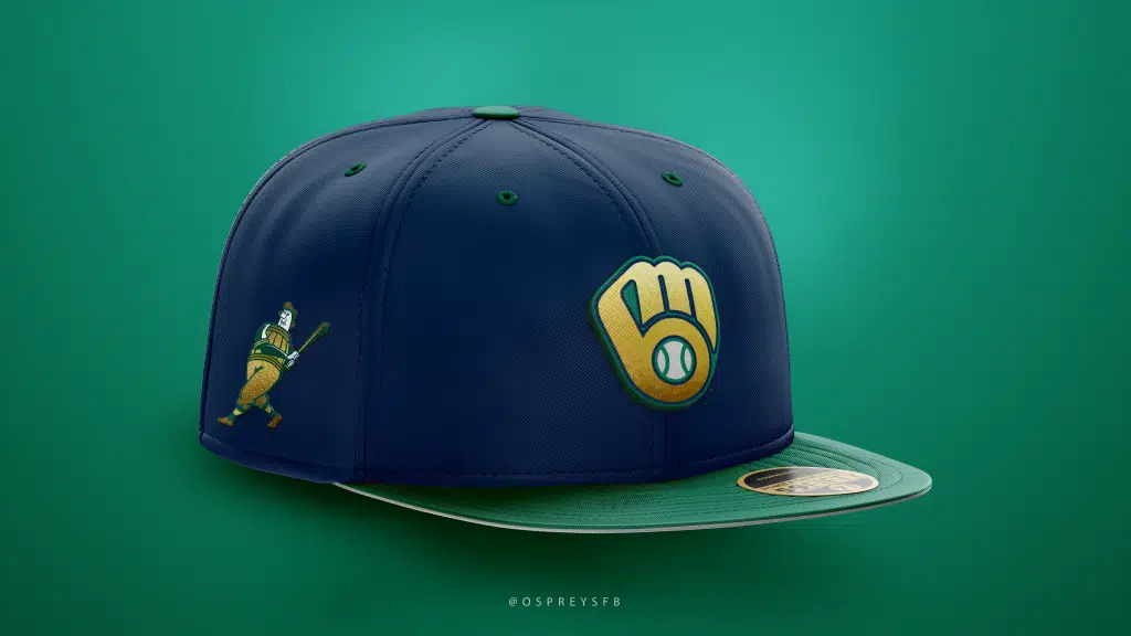
I’ve also added a concept for the Brewers, another one of my personal favorite designs. This one involves the classic “hidden MB” logo and the green-and-gold colors the team sported back in the early-to-mid 90s. Also included: Barrelman.
Lastly, I owe Joe Binder of Sox On 35th a big “thank you” for the opportunity to showcase some of these designs. I’m blown away by this site, and wish Joe ran a Phillies blog too!
PS: If you are really into learning more about sports aesthetics and the history behind them, check out UniWatch and Sportslogos.net. Both sites have been mandatory viewing for me for well-over a decade and are a lot of fun to dive into.
For more team designs, be sure to follow OC Ospreys at the following links:
Wonderful work all around. Take all of my money.
I personally don’t understand why it is so hard to find reproductions of the ’51-’62 “SOX” cap and clothing that uses the ’76-’81 jersey font. It’s underrated.
truely love what you created
Peter, I was trying to reply to your comment, but may be having a browser issue so hopefully you see this. Thank you for reading and for the kind words. I had a TON of fun making these concepts and hope to make more for Soxon35th in the future.